Note
Click here to download the full example code
The SIR model
In the SIR model, the rate of change of susceptible individuals is
and the rate of change of infectives is
The constant \(b\) is the rate of contact between people and \(c\) is the rate of recovery. We can also write down an equation for recovery as follows,
In this model \(S\), \(I\) and \(R\) are proportions of the population. Summing them up gives \(S+I+R=1\), since everyone in the popultaion is either susceptible, infective or recovered.
Let’s now solve these equations numerically. We start by importing the libraries we need from Python.
import numpy as np
import matplotlib.pyplot as plt
import matplotlib
from pylab import rcParams
matplotlib.font_manager.FontProperties(family='Helvetica',size=11)
rcParams['figure.figsize'] = 9/2.54, 9/2.54
from scipy import integrate
Now we define the model. This code creates a function which we can use to simulate differential equations (1) and (2). We also define the parameter values. You can change these to see how changes to the paramaters leads to changes in the outcome of the model.
Investigate yourself what happens when \(b=1/3, 1/6, 1/10\).
# Parameter values
beta = 1/2
gamma = 1/7

# Differential equation
def dXdt(X, t=0):
    return np.array([  - beta*X[0]*X[1] ,              #Susceptible X[0] is S
                      beta*X[0]*X[1]   - gamma*X[1],       #Infectives X[1] is I
                      gamma*X[1]])                      #Recovered X[2] is R
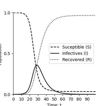
We solve the equations numerically and plot solution over time.
def plotEpidemicOverTime(ax,t,S,I,R):

    ax.plot(t, S, '--',color='k', label='Suceptible (S)')
    ax.plot(t, I  , '-',color='k', label='Infectives (I)')
    ax.plot(t, R  , ':',color='k', label='Recovered (R)')
    ax.legend(loc='best')
    ax.set_xlabel('Time: t')
    ax.set_ylabel('Population')
    ax.spines['top'].set_visible(False)
    ax.spines['right'].set_visible(False)
    ax.set_xticks(np.arange(0,100,step=10))
    ax.set_yticks(np.arange(0,1.01,step=0.5))
    ax.set_xlim(0,100)
    ax.set_ylim(0,1)


t = np.linspace(0, 100,  1000)               # time
X0 = np.array([0.9999, 0.0001,0.0000])      # initially 99.99% are uninfected
X = integrate.odeint(dXdt, X0, t)           # uses a Python package to simulate the interactions
S, I, R = X.T
fig,ax=plt.subplots(num=1)
plotEpidemicOverTime(ax,t,S,I,R)
plt.show()
As with the precator prey model we can find the equilibria where the rate at which people become infected equals the rate at which they recover by solving
This occurs either when \(I=0\) (no-one has the disease) or when \(S=\gamma/\beta\). We can now plot these equilibrium on the phase plane
def plotPhasePlane(ax,S,I):
    ax.plot(S, I, '-',color='k')
    ax.set_xlabel('Susceptibles: S')
    ax.set_ylabel('Infectives: I')
    ax.spines['top'].set_visible(False)
    ax.spines['right'].set_visible(False)
    ax.set_xticks(np.arange(0,1.01,step=0.5))
    ax.set_yticks(np.arange(0,1.01,step=0.5))
    ax.set_ylim(0,1)
    ax.set_xlim(0,1)

def drawArrows(ax,dXdt):
    x = np.linspace(0.05, 1 ,6)
    y = np.linspace(0.05, 1, 6)
    X , Y  = np.meshgrid(x, y)
    dX, dY, dZ = dXdt([X, Y,1-X-Y])
    #Make in to unit vectors.
    M = np.hypot(dX,dY)
    dX = dX/M
    dY = dY/M
    ax.quiver(X, Y, dX, dY, pivot='mid')

fig,ax=plt.subplots(num=1)
ax.plot([gamma/beta,gamma/beta],[-100,100],linestyle=':',color='k')
plotPhasePlane(ax,S,I)
drawArrows(ax,dXdt)
plt.show()

Total running time of the script: ( 0 minutes 0.129 seconds)