Note
Click here to download the full example code
Logistic map
The model
The logistic map is a discrete model of growth and regulatory feedback. It describes a variable \(x(k)\) which changes over discrete times steps. The variable might be, for example, size of an insect population.
We write the model as
The parameter \(b\) determines how much the insect population increases when
import numpy as np
import matplotlib.pyplot as plt
from pylab import rcParams
import matplotlib
rcParams['figure.figsize'] = 12/2.54, 6/2.54
matplotlib.font_manager.FontProperties(family='Helvetica',size=11)


def logisticmap(x0,b,n):
    xs=np.zeros(n+1)
    xs[0]=x0
    for k in range(n):
        xs[k+1]= b*xs[k]*(1-xs[k])
    return(xs)

b=2
x0=0.1
print('One iteration with b=%d:'%b )
print(logisticmap(x0,b,1))
print('Two iterations with b=%d:'%b )
print(logisticmap(x0,b,2))
print('Three iterations with b=%d:'%b )
print(logisticmap(x0,b,3))
One iteration with b=2:
[0.1  0.18]
Two iterations with b=2:
[0.1    0.18   0.2952]
Three iterations with b=2:
[0.1        0.18       0.2952     0.41611392]
If we keep iterating, we get
print('Eleven iterations with b=%d:'%b )
print(logisticmap(x0,2,11))
Eleven iterations with b=2:
[0.1        0.18       0.2952     0.41611392 0.48592625 0.49960386
 0.49999969 0.5        0.5        0.5        0.5        0.5       ]
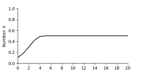
Change over time
Lets start by plotting for b=2
def formatFigure(ax,n):
    ax.set_ylabel('Number: $k$')
    ax.set_xlabel('Step: $x(k)$')
    ax.set_ylim((0,1))
    ax.set_xlim((0,n))
    ax.set_xticks(np.arange(0,n+1,n/10))
    ax.set_yticks(np.arange(0,1.01,0.2))
    ax.spines['top'].set_visible(False)
    ax.spines['right'].set_visible(False)

n=20

fig,ax=plt.subplots(num=1)
ax.plot(logisticmap(x0,2,n), color='black')
formatFigure(ax,n)
plt.show()
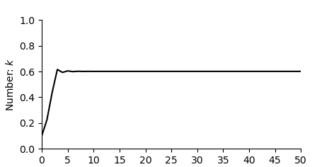
Increasing b
Now let’s take for b=2.5
n=50

fig,ax=plt.subplots(num=1)
ax.plot(logisticmap(x0,2.5,n), color='black')
formatFigure(ax,n)
plt.show()
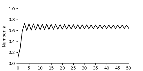
Then b= 3
fig,ax=plt.subplots(num=1)
ax.plot(logisticmap(x0,3,n), color='black')
formatFigure(ax,n)
plt.show()
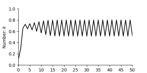
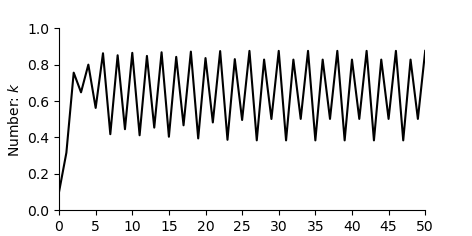
Then b= 3.2
fig,ax=plt.subplots(num=1)
ax.plot(logisticmap(x0,3.2,n), color='black')
formatFigure(ax,n)
plt.show()
Then b= 3.5
fig,ax=plt.subplots(num=1)
ax.plot(logisticmap(x0,3.5,n), color='black')
formatFigure(ax,n)
plt.show()
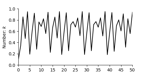
Then b= 3.8
fig,ax=plt.subplots(num=1)
ax.plot(logisticmap(x0,3.8,n), color='black')
formatFigure(ax,n)
plt.show()
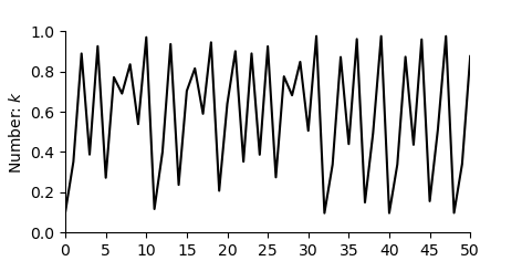
Then b= 3.9
fig,ax=plt.subplots(num=1)
ax.plot(logisticmap(x0,3.9,n), color='black')
formatFigure(ax,n)
plt.show()
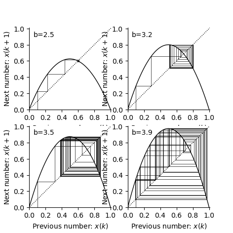
Cobweb diagrams
n = 50

b_vals=[2.5, 3.2, 3.5, 3.9]


rcParams['figure.figsize'] = 12/2.54, 12/2.54
fig,ax=plt.subplots(2,2)


for i,b in enumerate(b_vals):
    xs = logisticmap(0.1,b,50)
    xp = xs[0]
    ax[int(i/2)][np.mod(i,2)].plot([xp, xp],[0, xp],color='k',linewidth=0.5)
    for x in xs:
        ax[int(i/2)][np.mod(i,2)].plot([xp, xp],[xp, x],color='k',linewidth=0.5)
        ax[int(i/2)][np.mod(i,2)].plot([xp, x],[x, x],color='k',linewidth=0.5)
        xp = x

    xr=np.arange(0,1,0.001)
    fxr=b*xr*(1-xr)
    ax[int(i/2)][np.mod(i,2)].plot([-0.5, 105.5],[-0.5, 105.5],linestyle=':',color='k',linewidth=1)
    ax[int(i/2)][np.mod(i,2)].plot(xr,fxr,color='k',linewidth=1)
    ax[int(i/2)][np.mod(i,2)].set_xlabel('Previous number: $x(k)$')
    ax[int(i/2)][np.mod(i,2)].set_ylabel('Next number: $x(k+1)$')
    ax[int(i/2)][np.mod(i,2)].spines['top'].set_visible(False)
    ax[int(i/2)][np.mod(i,2)].spines['right'].set_visible(False)
    ax[int(i/2)][np.mod(i,2)].set_xticks(np.arange(0,1.01,step=0.20))
    ax[int(i/2)][np.mod(i,2)].set_yticks(np.arange(0,1.01,step=0.20))
    ax[int(i/2)][np.mod(i,2)].set_xlim(0,1.01)
    ax[int(i/2)][np.mod(i,2)].set_ylim(0,1.01)
    ax[int(i/2)][np.mod(i,2)].text(0.05,0.9,'b=%.1f'%b)

plt.show()
Sensitivity to initial conditions
For the case where \(b=3.9\) lets look what happens as we iterate the map.
n=7
b=3.9

print('Starting with 0.1001:' )
print(logisticmap(0.1,b,n))
print('Starting with 0.1002:' )
print(logisticmap(0.11,b,n))
Starting with 0.1001:
[0.1        0.351      0.8884161  0.38661844 0.92486402 0.27101319
 0.77050365 0.68962832]
Starting with 0.1002:
[0.11       0.38181    0.92052138 0.28533089 0.79527697 0.63496489
 0.90395947 0.33858531]
Notice that even after a small number of iterations two initially close points are far apart.
Now let’s make the difference only 0.001 and plot the change over time.
n=30
b=3.9

fig,ax=plt.subplots(num=1)
ax.plot(logisticmap(0.1000,b,n), color='black')
ax.plot(logisticmap(0.1001,b,n), color='black',linestyle=':')
formatFigure(ax,n)
plt.show()
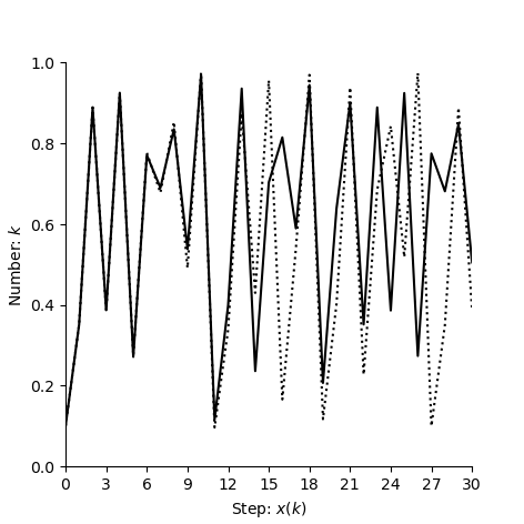
It is this sensitivity to initial conditions which characterises choas. If we take two nearby points then (in almost all cases) they diverge after a small number of iteractions.
Total running time of the script: ( 0 minutes 1.042 seconds)